Punch the sky
Regular readers of my Lightroom rantings will no doubt be aware that I’m not a big enthusiast for Develop presets, and I use them so rarely that I probably wouldn’t miss them if they weren’t there (along with Quick Develop, the Tone Curve, Snapshots, and the Filter Panel).
 But to be fair, presets are an efficient way to apply a consistent treatment, and I do have a few that I use now and again. My ire is really better directed at the unending stream of presets being offered up as though they’re the dog’s bollocks, and at the enthusiasm of those who keep gobbling them up by the dozen. So why am I posting this 4 punch graduated filter preset?
Well, I’ve not had a Pauline moment (or as a vegetarian been eating those canine orbs) but wanted to illustrate a point about applying Lightroom’s graduated filters to weak-looking skies. As in this article, the obvious approach is to add a Graduated Filter with a negative Exposure or Brightness value, mimicking the effect of graduated lens filters on the upper part of the frame. But it isn’t the only way to approach the problem.
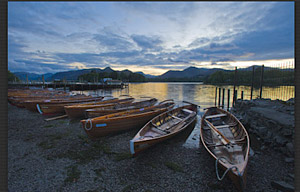
The first picture here is the unaltered image and while there is some cloud detail, much of the sky is weak. A negative Exposure or Brightness Graduated Filter would darken all tones at the top of the image, so often my first choice is something we could never do with lens filters – Clarity. 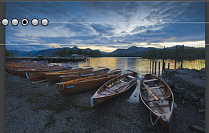 This slider increases local contrast, and can be applied to the whole image (in the Basic panel) or with the graduated filter tool – in which case you can apply it as many times as you want (even to the entire image what, another preset?).
In this case I’ve applied it 4 times, darkening my clouds and making them stand out much more against the surrounding lighter areas. It is an effect that can, of course, be overdone and perhaps works best where the clouds are heavy, and less well on blue skies with puffy white clouds. It’s also not a case of either Clarity or Exposure in a Graduated Filter, but using them in combination for more subtle results – with a bit more punch in the sky, you can set more restrained Exposure or Brightness values. That’s the 5th, middle dot.
As for the preset, I grouped the 5 filters to make their relationship obvious. I’ll have to upload it to the Adobe Exchange – it’s the dog’s bollocks, honestly.