The bleeding war book
So often it takes a fresh pair of eyes to notice something. As I wrote here, I'm designing my Blurb book in InDesign rather than following BookSmart's canned layouts, meaning the recommended workflow is InDesign > PDF > Photoshop > PNGs > BookSmart. While I could set up a Configurator app to automate saving multiple PNG files, these Photoshop batch processing things always break or involve an inordinate - if for some enjoyable - amount of tinkering (hence Lightroom).
But there's an easier way… InDesign > PDF > Acrobat > PNGs > BookSmart. So you create the book layout in InDesign, then export the PDF and choose the option to open in Acrobat. Once in Acrobat, it's File > Save As, and PNG is one option. You get one PNG per page, and they're numbered sequentially so you just import them into BookSmart, check they're sorted by filename, and then use AutoFlow to create the pages in the right order. It makes revising the design and getting it into BookSmart a relatively slick process.
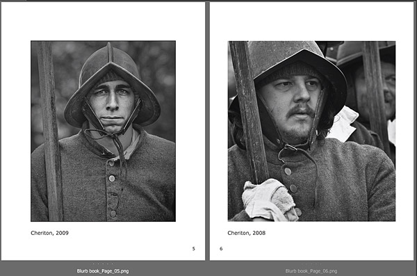
With the workflow wrinkles being smoothed out, I'm now putting more thought into the layout, and the big decisions so far have been about borders and bleeding. My initial inclination was that I wanted all pages to have the non-bled art book style of the above screenshot. So a single image centred on the page, with a brief title, a page number, and no decoration - just lots of white around the picture. And to my eye a plain, fine black border looks as right on the book layout as it does on an inkjet print (it's slightly exaggerated in the screenshot but the one on the left has the border).
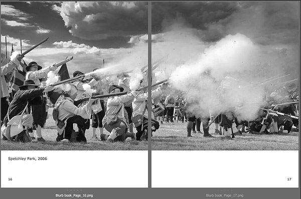
Yet the more I've been playing around, the less sure I am that this design works. For one thing, have you ever noticed that pictures in coffee table books never have borders? That's the case even when a bright area lies close to a picture's edge and seems to leak out into the surrounding paper. Of course, it's not a rule or convention that one needs to follow, but “borderless-ness” (an Iain Dowieism?) seems inevitably intertwined with a bigger decision about whether to keep the non-bled fine art look which suits the above portraits, or adopt a mixed layout with fully-bled pages. In terms of my bookshelf, it's Fay Godwin's Our Forbidden Land versus Don McCullin's Sleeping with Ghosts, and a much-published friend put it really well:
I do think these considerations should be primarily content driven. Fay Godwin's landscapes are for the most part timeless, immutable and essentially static so the design should reflect that unlike my dynamic and anything but static pics of musicians!
Don McCullin it has to be ;).